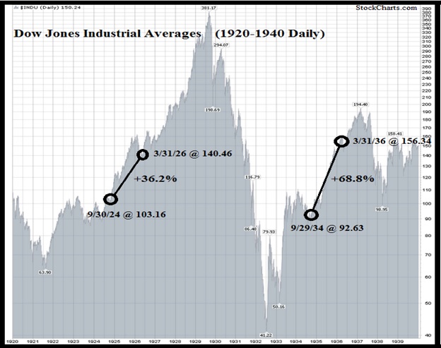
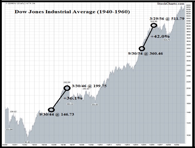
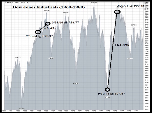
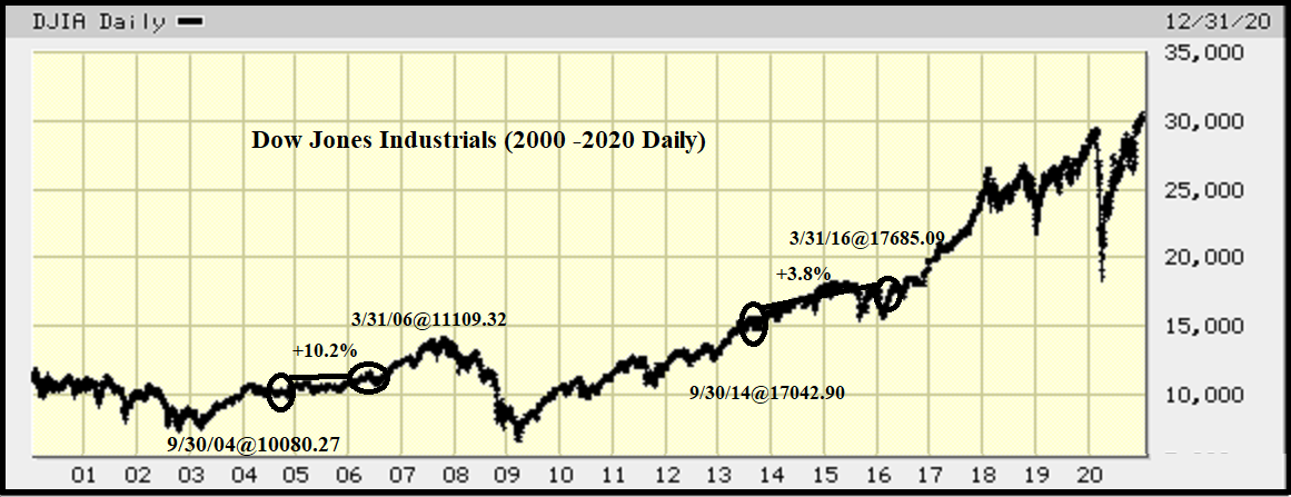
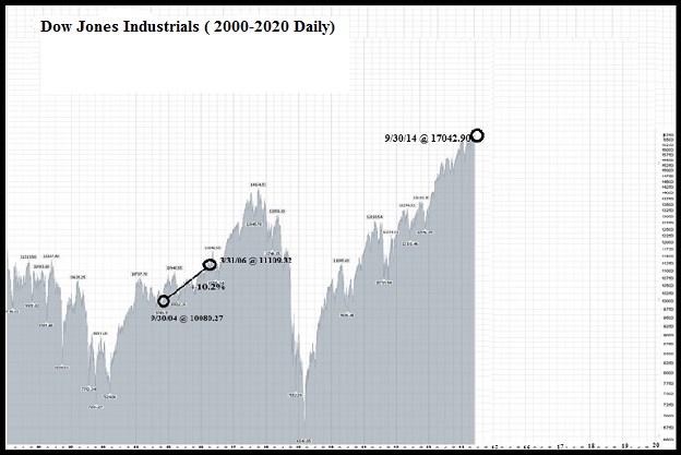
September 30th of the 4th year of the decade is a special time. Over the following 18 month timeframe the market has risen 100% of the time, going back to 1904. This was brought to my attention by a Subscriber (thanks to Craig S.) that there is an 18- month phenomenon that has shown a +41.8% average return, that I had never heard of. What, how, when, you say? It happens, and I can’t imagine why it happens, but every mid-decade for over a century there is a period from September 30th of the 4th year to March 31st of the 6th year that has been profitable in all twelve such periods. Only three times (+3.8%,+5.6%, and +10.2%) was the gain less than +36%, with four times over +64% for the 18 month timeframe. I found it amazing so I checked it out myself and it truly has happened. I traced the mention of it to Jay Koeppel at JayOnTheMarkets.com, but am not sure where the originating credit belongs. There has been for some years a “Decennial Cycle” phenomenon described in Stock Trader’s Almanac showing that the 5th year of decades (i.e, 2015) has had the best average annual change (+28.3%) during any decade, nearly twice the next best year. I suspect this 18-month phenomenon has expanded back three months from the 5th year record to incorporate the typical preceding year-end rally with the “Halloween Indicator” often described by Mark Hulbert in MarketWatch, which shows the seasonal strength from October 31st to the following May 1st. Additionally it skips on through the 5th year by adding the three months leading toward the following “Sell in May, and go Away” resulting in an 18 month period with the wind at its back. Will this 18-month cycle work in the next 18 months? Who knows, but I sure wouldn’t want to bet against it. The most recent decade had the worst results of the 120 year period, but it was still positive! Notice the following charts encompass two decades each with the two 18-month periods shown:
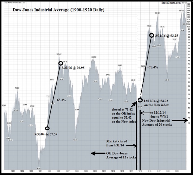 This graph takes some explanation. The market was closed starting on 7/31/14 due to World War I and when it was reopened on 12/12/14 a different calculation was used involving 20 stocks instead of the 12 it had previously been used. The closing level was 71.42 and the reopening was at 54.72 as the chart shows. What it does not show is that the market was closed between those dates and the closing level of 71.42 was the equivalent of 52.42 on the new index which opened at 54.72, an actual gain not originally indicated on this chart (sorry StockCharts.com, but thanks for the underlying charts), thus we have modified it as best as we can to clearly show the conversion. Because of the closure of the Exchange, the Buy could not be made on September 30th so was made on the opening on December 12th The following charts require no such explanation as any changes to the content of the Dow Jones Industrials used a divisor which made transitions seamless.
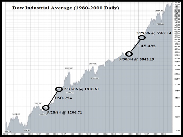 Sorry, but no longer have access to the chart service that made these charts, therefore I insert this one from bigcharts.marketwatch.com which is considerably less impressive (but then again, so are the results shown):

